
In higher education, color does more than reflect brand identity–it builds emotion, guides navigation, and shapes first impressions. But when color is used without accessibility in mind, it can unintentionally exclude users who experience the visual world differently. An inclusive digital experience means thinking beyond aesthetics.
Accessible color design ensures your content works for people across a broad range of visual abilities, not just those who see it the way you do.
How Users Perceive Color Differently
For many users, color isn’t just a stylistic flourish—it’s a barrier. From red-green color blindness (the most common) to complete color vision deficiency, millions of people interpret your site’s palette differently. That means color alone shouldn’t carry the burden of meaning. Color is not inherently detrimental to an accessible user experience.
The key is that color should never be the sole source of information or the only visual cue for effective communication.
Understanding Color Vision Deficiency (CVD)
Color Vision Deficiency (CVD), also known as color blindness, can make it challenging for users to distinguish certain colors or to perceive colors at all. It’s standard to plan for red-green color blindness because it’s the most commonly cited, but blue-yellow deficiency and complete color blindness affect users in ways that are just as disruptive and far less often accounted for.
Click the different vision types to discover how users with CVD see color on websites.
According to a study by Vision Center, around 1 in 12 men (about 8%) and 1 in 200 women (about 0.5%) worldwide have some form of color vision deficiency. Globally, that adds up to an estimated 300 million people. A 2025 meta-analysis published in the AAO Journal, one of the largest studies of its kind, drawing on data from over 1.7 million participants, found that among children and adolescents, the overall prevalence is approximately 2.59%. Boys are significantly more affected at 4.38%, compared to 0.64% for girls.
Given these statistics, it is clear that higher education websites must be designed to accommodate the substantial number of users with color vision deficiency.
Why Websites Should Not Rely on Color Alone
Color independence is a key principle, working alongside the accommodation of users with color vision deficiency. Color dependency, where users rely solely on color to interpret information, is problematic due to the wide variation in color perception. Therefore, our goal is to achieve color independence on websites, using color to enhance content rather than convey essential meaning.
Consider the example of this campus map: its primary indicators for reading the map rely heavily on color. The two versions below clearly demonstrate the extent to which color is doing the heavy lifting. Without color, understanding how the legend corresponds to map locations becomes challenging.
While some locations have associated numbers, this numbering is inconsistent, further confusing users, particularly when trying to locate faculty and staff buildings.


A comparison of the Northern Michigan University Campus Map in black and white (left) and full color (right) clearly illustrates the issue of color dependence.
An easy way to make this map more accessible and color-independent is to use icons or other indicators that do not rely on color.
Designing Accessible User Experiences
Understanding the distinction between color-dependent and color-independent design will reveal that it influences far more of your website than you may initially think.
Here are a few ways to address common pitfalls.
Guide the eye with shape, weight, and position rather than relying solely on hue.
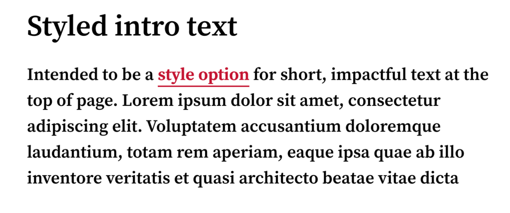
For instance, on the Carnegie Mellon University design system example below, the link’s caption is initially red and underlined. When a user hovers over it, the text and underline become bold. This change provides a clear visual cue that the element is clickable, ensuring accessibility for all users, regardless of their ability to perceive color.

- To ensure readability and prevent important information from being missed, underline inline links to make them easily distinguishable from the surrounding body copy.
This is particularly crucial for long-form pages, such as academic program pages, where prospective students typically scan large amounts of content. Clearly marking embedded links allows users to quickly recognize and explore related information rather than skipping over it because the links blend too seamlessly into the main text.
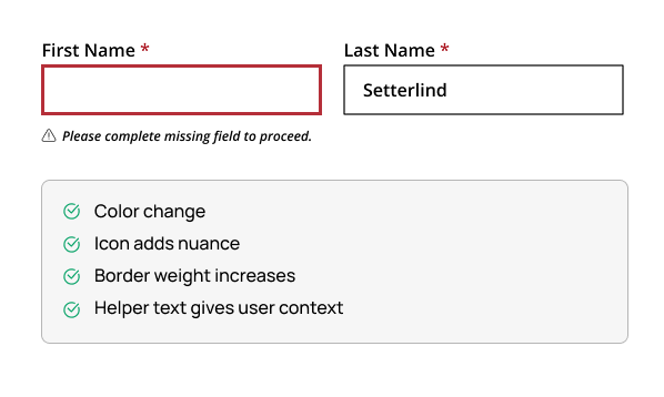
- Adding text or icons to error states helps users understand what the issue is, rather than relying solely on red outlines.
When designing forms, ensure error states use text or icons in addition to color (like red outlines). For higher education institutions, accessible forms are vital, particularly on landing pages where form completion is the primary user action.
- Ensure emergency alerts and information banners stand out.
Accent them with icons, headings, or other layout cues rather than relying solely on color (such as red or yellow tones) to grab attention.

In addition to these standards, use tools like the Color Vision Simulator developed by Michigan State University to better understand how colors are perceived by different users.
These methods are designed not only to assist users with color vision deficiencies but also to improve cognitive processing for all users.
When color is thoughtfully combined with other elements, it leads to a more intuitive and better user experience for all sighted users, regardless of whether they have color vision deficiencies. When you remove color dependence from the equation, contrast becomes the next layer of the foundation.
When Using Color, Contrast Is the Foundation of Readability
Good contrast is foundational to accessible web design because it improves readability for everyone, especially users with low vision or those browsing on mobile in bright sunlight.
The most up-to-date accessibility guidelines, WCAG 2.2, set clear benchmarks:
- Text and images of text must have a contrast ratio of at least 4.5:1
- Large text, icons, and buttons require a contrast ratio of 3:1.
- Logos and purely decorative elements are technically exempt, but improving contrast still boosts clarity and polish.
Read more: Tips for Designing for Web Accessibility
How To Avoid Common Color Contrast Mistakes
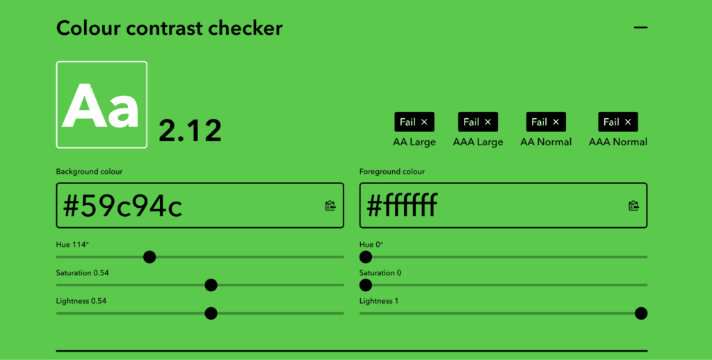
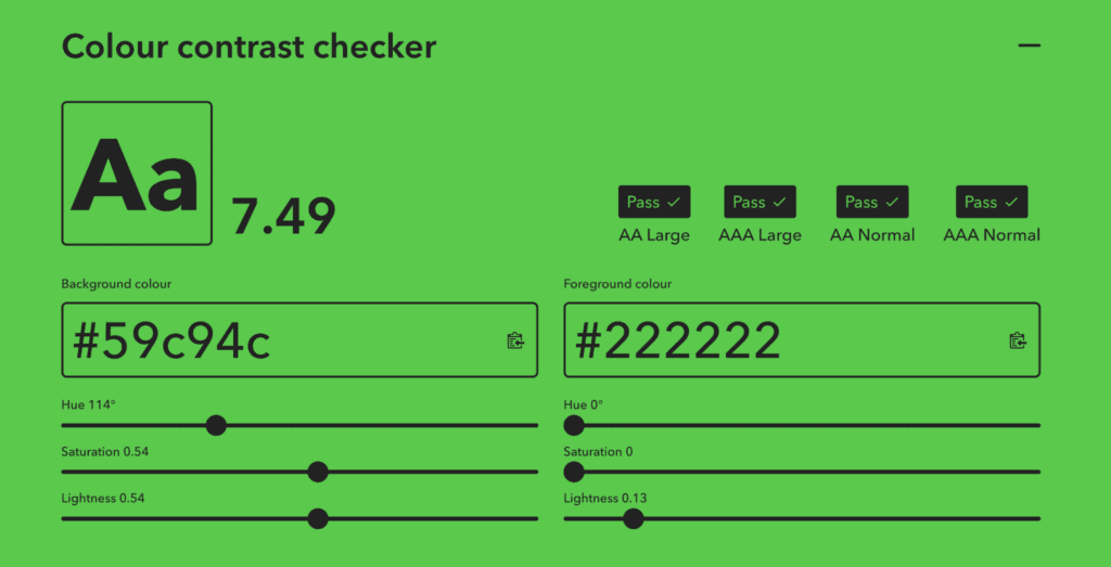
Color contrast is crucial, but it’s easy to fall into common traps, especially in fast-moving design projects or when faced with multiple rounds of feedback. To prevent this, test colors consistently throughout the design process, not just at the start or end. Use tools like Color Contrast Checker, which can help you validate color choices on the fly.
Frequent pitfalls include:
- Light text on vibrant brand colors like golds, oranges, teals, or greens often fails contrast checks. To ensure brand colors meet accessibility standards, we use Figma plugins and also tools like Coolors ColorBot to help create more accessible color palettes.
- Buttons with thin outlines or hover styles that aren’t visually distinct can hinder the user experience. To ensure you meet the button contrast requirements, we use the tool ButtonBuddy to create more accessible button styles.
Contrast Is Key, but Luminosity Is Also Important
Most accessibility conversations focus on color contrast, but luminosity is also important for how users perceive and read content on the web. In web design, luminosity refers to the perceived brightness of a color: how much light it appears to emit or reflect to the human eye.
Imagine a lemon yellow next to a navy blue. Even before you think about contrast, the yellow seems to jump forward, and the navy recedes. That’s luminosity at work. Your eye perceives the yellow as brighter, regardless of what’s next to it.
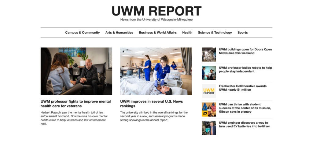
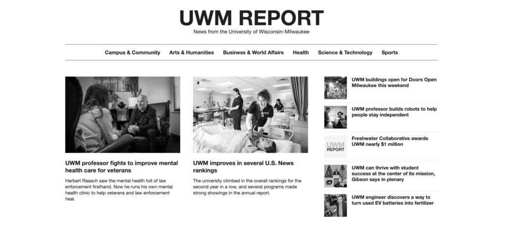
If users struggle with color vision deficiencies or low vision, a higher luminosity can help. Here’s an example from the University of Wisconsin-Milwaukee’s News website.
UWM’s former news site hero design lacked sufficient color contrast and luminosity.
How the page appeared to users without a color vision deficiency:

The yellow and gray text lacks contrast in this view.
How the page appeared to users with complete color blindness (monochromacy):

The yellow and gray text lacks contrast and luminosity in this view.
To enhance both contrast and luminosity for individuals with color blindness and low vision, our solution was straightforward: select a color with higher contrast against the white background. As a result, the text is clearly visible in both situations.
Designing With Institutions’ Color Palettes
Many institutions arrive at the table with a well-defined color palette, often developed for print, where glossy brochures and large-scale banners follow different rules. Balancing brand guidelines with contrast standards is a common challenge, and the answer is rarely as simple as “just change the color.” Color is deeply tied to institutional identity, and any shift needs to be made thoughtfully.
But there are ways to honor the brand while adapting it for the web in an inclusive way. That might mean:
- Adjusting a primary brand color slightly to meet contrast thresholds.
- Introducing accessible tints, tones, or utility colors for digital use.
- Testing combinations across multiple devices, light/dark modes, and accessibility simulators.
Adapting Brand Colors for Digital Accessibility
We collaborate with stakeholders and make smart, data-backed adjustments that preserve visual integrity while meeting accessibility standards.
Here are a few examples of how we’ve solved common color contrast challenges in real-world projects
Example 1: Georgia Southern University
Challenge: The brand’s primary gold did not meet contrast guidelines for buttons and call-to-action areas.
Solution: We introduced a deeper, web-compliant shade for buttons and underlines and increased the weight of underlined links on hover to avoid color dependence.

Example 2: University of Mount Union
Challenges:
- The white text over images lacked sufficient contrast and lacked an intuitive hover effect to indicate to users that they were clickable. The white text on images lacked sufficient contrast and an obvious hover effect, making it difficult for users to identify clickable elements.
- The bright red chosen for the creative campaign posed accessibility issues when paired with white text, especially for buttons and other interactive elements.
Solution:
- To ensure sufficient contrast with white text, a gradient was added to the bottom of the images. This preserves the image’s overall brightness, preventing it from appearing too dark or “muddy.” Additionally, an underline hover effect on titles indicates to the user that they are clickable.

- The bright red was a critical part of the creative campaign, so we incorporated it decoratively into cards and backgrounds.

Beautiful and Accessible Aren’t Opposites — They’re the Standard
Color is one of the most powerful tools in a brand’s arsenal — but its power depends entirely on how intentionally it’s used. The institutions getting this right aren’t treating accessibility as a constraint on their brand. They’re discovering that designing for everyone makes the brand stronger, clearer, and more trustworthy for all users.
Accessibility doesn’t stop at color. If you’re looking for a partner to help you create accessible web experiences while honoring your institution’s current colors and design, our web development team specializes in creating beautiful and accessible designs. Reach out and start a conversation.
Accessibility and Color Design Questions Answered
What is color vision deficiency and how common is it?
Color vision deficiency, also known as color blindness, makes it difficult for users to distinguish or perceive certain colors. According to Vision Center, approximately 1 in 12 men and 1 in 200 women worldwide are affected, totaling an estimated 300 million people globally.
Why should higher education websites not rely on color alone?
Color perception varies widely across users, so using color as the sole source of information creates barriers for those with color vision deficiencies. Color should enhance content rather than carry essential meaning on its own.
What contrast ratios are required for accessible web design?
WCAG 2.2 guidelines require a contrast ratio of at least 4.5:1 for text and images of text, and at least 3:1 for large text, icons, and buttons. Logos and purely decorative elements are technically exempt, though improving their contrast still adds clarity.
What tools does Carnegie use to test color accessibility?
Carnegie uses tools like the Color Contrast Checker, Coolors ColorBot, ButtonBuddy, and the Color Vision Simulator developed by Michigan State University to evaluate and improve color choices throughout the design process.
How does Carnegie balance institutional brand colors with accessibility requirements?
Carnegie works with stakeholders to make thoughtful adjustments such as introducing accessible tints or utility colors for digital use, slightly modifying primary brand colors to meet contrast thresholds, and testing combinations across devices and accessibility simulators.
What is luminosity and why does it matter for accessibility?
Luminosity refers to the perceived brightness of a color and affects how easily users can read content, especially those with low vision or color blindness. Higher luminosity can improve readability for users who struggle to distinguish colors by contrast alone.
How should error states and alerts be designed to avoid color dependence?
Error states should include text labels or icons alongside color cues like red outlines so users understand the issue without relying on color. Emergency alerts and information banners should also use icons, headings, or layout cues to draw attention.
Why is underlining inline links important for accessible web design?
Underlining inline links makes them easily distinguishable from surrounding body copy without relying on color alone. This is especially important on long-form pages like academic program pages, where users scan large amounts of content.